
As a web developer (as opposed to a web designer) I have a love/hate relationship with CSS.
I’ll be the first to admit I’m no designer and I much prefer getting some code functional and operational with a view to making it look nice later on. This means I absolutely love tools like Bootstrap because I can just spin up something which looks half-decent quickly and put all my time and effort into the server-side logic.
So Bootstrap is wonderful but you do end up in the situation where your site looks like every other generic Bootstrap site. It’s kind of like WinForms for the web. Sooner or later you will want to customise your styling and attempt to give it your own touch, however minor or major.
This is where you dive into the stylesheets and possibly end up getting frustrated!
CSS is incredibly flexible. The cost of this level of power is that you need to take a little time to understand how it works. If your approach to styling is googling how to affect an element, ending up on w3schools.com and pasting a style into your code. You may be doing it wrong!
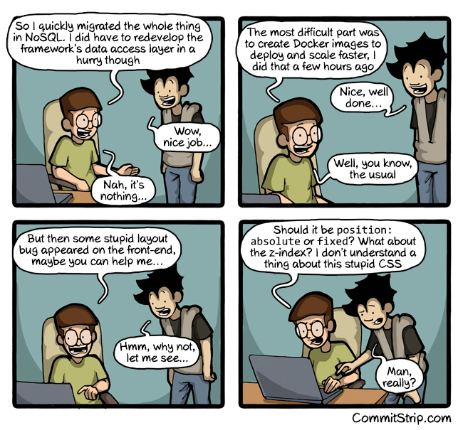 CSS Comic courtesy
of CommitStrip
CSS Comic courtesy
of CommitStrip
The bottom line is that if you are a web developer who gets involved with front-end code you’ll more than likely have to deal with CSS. This doesn’t have to be a harrowing experience. In fact it can actually be quite enjoyable (it can also be a nightmare too but let’s stay positive!).
I was lucky enough to be sent on a two-day course on CSS3 a few years ago and it definately changed my thinking. Time is precious but if you dedicate a few hours to learning some key concepts about CSS, it’ll probably make your life much easier.
If you are having issues trying to lay out elements, make sure you are aware of what the CSS Box Model is. I won’t try to explain it all here as there are numerous better explanations which you can find by searching. Essentially it is a box which wraps every HTML element. The content is in the centre, surrounded by padding, which is wrapped by a border and it has a margin on the outside.
The easiest way to visualise this if you have Chrome is to right-click any element on a web page and select Inspect. When the developer tools open up, ensure the Elements tab is selected and scroll all the way down to the bottom of the Style tab on the right-hand side of the page. You should see a representation of the box model for the HTML element you have selected.
Why does the layout go crazy?
An important fact to take away from this if you are having problems trying to align an element is that the content, padding, border and margin may all have explicit widths and heights you need to take into account. Imagine you have a 100 pixel wide container and you put two divs inside it which are each 45 pixels wide. Each div also has a 2 pixel wide border.
A quick calculation shows the contents of your container should be 98 pixels wide and fit perfectly. But if something isn’t working you may want to check the values of the padding and margins too. If the entire width exceeds 100 pixels, the browser will most likely try to guess what you intended to do and make the best fit it can. This can sometimes be the root of your alignment issues.
Why is putting content in the centre so hard?
Another good way to think of a page with CSS styling is: It’s a big tank of water and all the HTML elements in it float. This means when you create a new element on the page, by default, it will be pushed right up to the top of the page. Unless it has an defined width it’ll also spread out to the full width of the page. So how do you put it in the centre of the page?
Next thing to google here is what is meant by a block element and what is meant by an inline element. Again, there is great documentation already online but a block element is basically a box and it can have height and width. An inline element does not have dimensions and usually represents inline content such as flowing text. Inline elements are usually constrained within block elements.
So we still need to centre this? First it’ll need a width which means it’ll also need to be a block element. Remember that logically the width you specify needs to be larger than the content inside the element (otherwise it doesn’t add up!) and needs to be smaller than the width of the browser screen. Assuming you have this working so far, the only other style you should need is:
margin: 0 auto
The zero refers to the top and bottom margin and auto refers to the left and right margins. Auto just means balance out the left and right margins equally, meaning your element should now be centred in the page.
CSS is global so deal with it
In most areas of software development we’ve decided that using global scope for anything usually causes us problems somewhere down the line so we’ve trained ourselves to encapsulate behaviours and properties into objects. I don’t think this practice has made it into the CSS world yet.
In fact the “Cascading” part of the name seems to encourage you to create a top-level (i.e. global) style and let it flow down to embedded elements across multiple pages. Which is a great idea in a perfect world if you know what the final structure of your HTML will be.
In the real world, sites evolve organically, different types of pages are added to sites and layouts are tweaked. Through experience what I’ve found happens is that global styles will be created but they will be overridden multiple times by styles targeted at lower level elements.
You can diagnose if this is happening by looking at the Styles tab in the Chrome developer tools. When you are inspecting an element, any style with a strike-through is a style which would have targeted your element but another style has overridden it. You can tweak styles on and off in the developer tools using checkboxes.
Overriding a style is not necessary a bad thing but if you are doing it excessively and having trouble styling your website, it could be an indicator that you should stop, refactor and simplify your CSS.
There is a default CSS stylesheet
When I began playing with CSS, some of the issues which plagued me that I couldn’t resolve related to layout behavours when I had not even written any style rules. Where is that margin or spacing coming from? I haven’t even created any margin rules yet!
So, it turns out the browser has it’s own default stylesheet which is applied. These may differ slightly between different browsers and browser versions but the W3C default stylesheet for HTML 4 is a good baseline reference for what is probably happening in your page by default.
As a side note, there are so-called CSS resets out there of varying degrees. These are stylesheets which attempt to completely or partially override any styling applied by the browser default stylesheet. It’s up to you but I would consider using CSS resets to be an advanced topic which you can safely avoid unless you are more curious.
The default stylesheet shouldn’t get in your way and in the vast majority of cases it helps you out by setting up common HTML tags to display in the way you would expect them to. Such as ordered and unordered lists having a left margin. Or headings being in larger, bolded text.
A few suggestions to keep your CSS manageable
Finally, here’s a few tips:
-
Put ALL your styles in a CSS file: Don’t put any styles inline. You’ll regret it later if you have styling spread all over your site. Keep them in a style sheet. If a style only ever needs to target a single element, put it in the stylesheet and target it at the ID of the element.
-
Split your styles in multiple CSS files if it makes sense: If you have built up many rules it may make sense to create different stylesheets for the types of rules you have. You could have a typography stylesheet which only holds font-related styles. You could also have a layout stylesheet which only holds rules relating to spacing and alignment. Or, you could put all the rules related to styling a HTML component on your page in a separate stylesheet.
-
Use top-level styles but don’t make them too opinionated: Generally, only apply a top-level style if you are confident you want that style to apply to EVERYTHING on your page now and in the future. Out of habit, I usually set body to have a font-family of sans-serif to banish the Times New Roman font but I’ll target all other rules at lower level elements. Especially anything which is affecting layout.
-
Refactor your CSS early: Large and messy CSS is a nightmare to change! You don’t have unit tests to protect you. If you change a rule which is applied site-wide, you’ll have to view all the pages in your site to verify you haven’t broken anything. Alternatively, tweak the style and pray it works! It’s preferably to avoid getting into this situation if you can though. While you are coding your CSS, if you see an opportunity to simplify a rule while you are creating it or just after and can easily verify the effect of the refactoring.. DO IT! I don’t believe large scale CSS refactoring after the fact really works.. You end up just scrapping the stylesheet and starting over as it’s the more workable solution. Your objective should be to style your site with the most simple, straightforward stylesheet you can. The prospect of changing or adding a style in the future should not fill you with dread.
-
This is not a CSS tutorial or even a guide to best practice: There are numerous great tutorials for CSS on the web so please don’t trust my opinions on this page as even being examples of best practice. I’m a developer, not a designer. What I hope I have shown you is how to avoid a few gotchas and what you can research to be able to tackle CSS with confidence.